
INTERACTIVE SHOWCASE
Live Data Dashboards
Don't take our word for it. Explore four working dashboards for mining, workforce, hospitality and retail. Filter by site, state or period, click any chart to drill down, and switch between charts and tables.
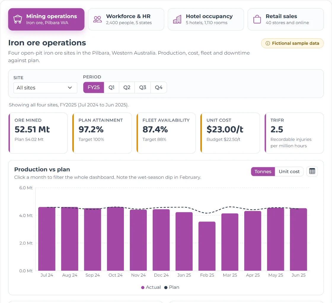
Four dashboards, one click away
Every chart responds to the filters. Click a bar to drill down, use the toggles to switch views, and open the table icon to see the numbers behind any chart.
Mining operations
Iron ore production against plan, unit cost, fleet availability, downtime and safety across four Pilbara sites, including the wet-season dip.
Workforce & HR
Headcount, annualised turnover, exit reasons, tenure, age and gender for a 2,400-person company across five states.
Hotel occupancy
Occupancy, average daily rate, RevPAR and booking channels for five hotels, with event peaks like Melbourne Cup and New Year's Eve.
Retail sales
Weekly sales against last year, gross margin and category mix for 40 stores and online, through Black Friday, Christmas and EOFY.
A note on how these demos are made. We built this showcase with lightweight web charts so you can explore it instantly, right here in your browser. For our clients, we build reports and dashboards in Power BI or Tableau, so your teams get trusted, secure tools they already know, with scheduled refresh and access controls built in. All companies, sites and figures on this page are fictional and contain no client or personal information.
What's behind a dashboard like this
Agree the questions
We start with the decisions people need to make, then define each KPI once, so "occupancy" or "turnover" means the same thing everywhere.
Connect and model
We bring data from systems such as your ERP, HRIS, PMS or POS into a governed model in Microsoft Fabric, Databricks or Snowflake.
Design for action
Clear KPIs, targets and drill paths that go from the big picture to the detail, built in Power BI or Tableau.
Drive adoption
Training, row-level security and automated refresh, so the right people see the right numbers and actually use them.
Frequently Asked Questions
Want dashboards like these on your own data?
Book a free 30-minute session. We'll look at your reporting today and sketch what's possible.